Set up a custom email template using Websand
As much as you might love to, you can’t sit your subscribers or customers down for a tea or coffee. You rarely get the chance for that face-to-face conversation. What’s the next best thing?
No, not social media. Email. The inbox is hallowed territory. Your entry into it doesn’t depend on algorithms or ‘paying to play’. Your subscriber sees it when they see it. Not when the email provider chooses to display it.
That makes email marketing both powerful and difficult. You need to make a stellar impression among the clutter. Having beautifully designed and supremely valuable emails is one way to do that.
We’ve talked before about custom templates, both in Websand and other providers. To cut a long story short, they save time. Set it up once and send. Then change the content and send. Rinse and repeat (the second part, at least).
But how do you set up a template? We’ll walk you through setting up a template to deliver a lead magnet in Websand. Even during GDPR (we’ve got compliance baked in, by the way)? Lead magnets are still a great way to prove your worth to new subscribers. Get to know them and convert them to customers and, eventually, part of your community.
And welcome emails can generate 320% more income than other emails. So they’re worth getting right.
Let’s get started.
Choosing your starting Email Design Template
Head over to ‘Design’ in the left sidebar. In the top right of the screen, find the drop-down menu.
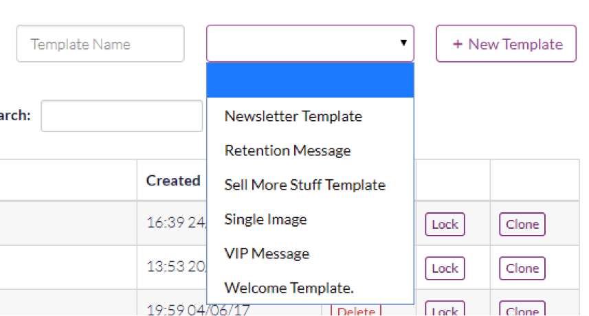
Choose the template you want to start with. For this post, we’ll use the Welcome Template so you can deliver your lead magnet. Give the template a name so you can find it later. Hit +New Template to get started.

You’ll see this template. It’s already populated with content which gives you a good idea of what can go where. You can edit these boxes, add more, or change the colours. Whatever helps you communicate your brand. 64% of users say they prefer rich text emails so give them something awesome to look at.
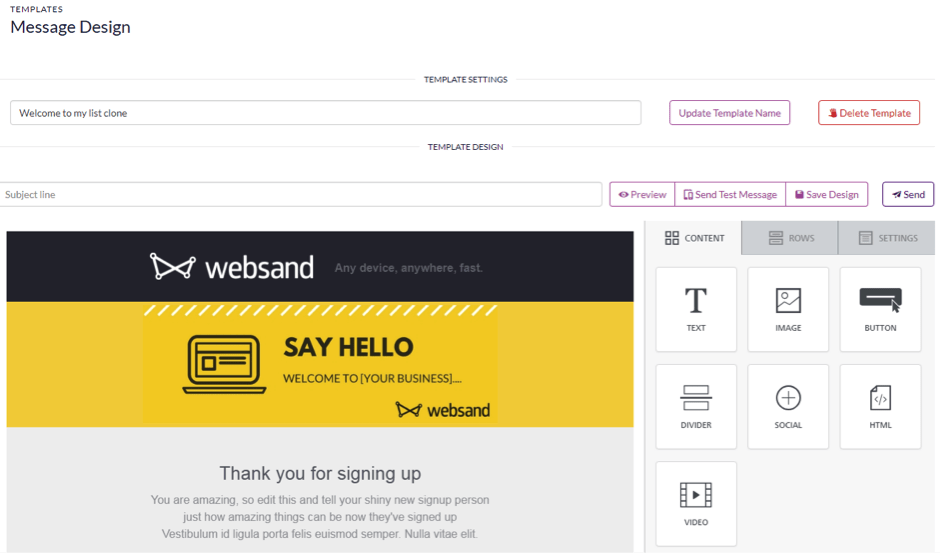
We should point out that these lovely templates are mobile responsive. So they’ll look brilliant on any device.
Let’s get into editing the email design template.
Setting Up The Header
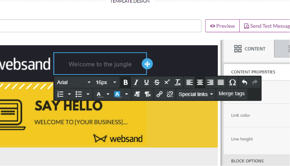
We’ll start with the header. It’s the first thing your subscriber sees, so it’s your opportunity to make it clear who you are. Click on the text box to get started. Type in your tagline alongside the logo. Format the text, changing the font, size, and alignment.
Now let’s change your logo. Because as much as you love Websand, you want to show off your own identity.
But first some notes on images
No resizing of images required. The image will automatically resize based on the where you place the image block.
Connect your social media library. When you click on ‘change image’ you’ll enter the file manager, click on the import button and you can connect your Websand to your existing image libraries be that your Instagram or Facebook account or stored within Google Drive or Dropbox
Yes you can use gifs. But for video you’ll have to use the video block and have the video you wish to share hosted on youtube or vimeo.
Adding or changing an image on your email template
To change your logo within the header of the template. Click on the logo to activate the block. Head to ‘Change image’.
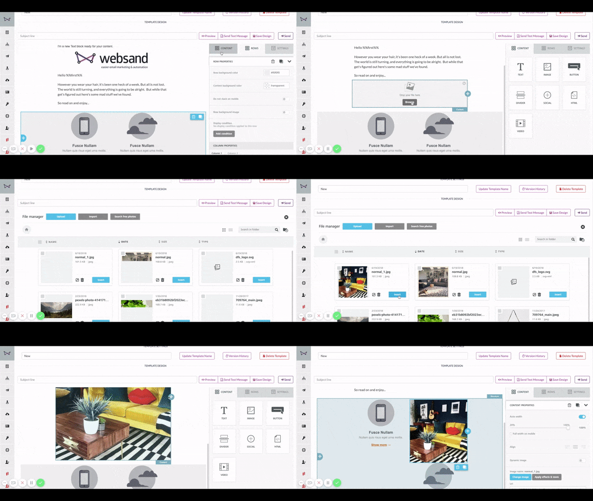
No need to resize your image as the image will automatically resize Ask your designer for a PNG version with a transparent background to avoid a nasty outline on the logo. Unless your logo is square or rectangular.
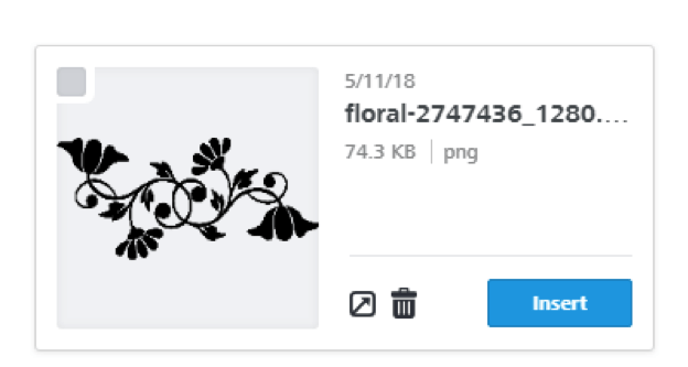
Upload your graphic and hit ‘insert’. Hey, presto!
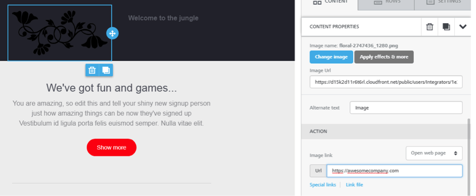
We’d also recommend you change the URL for the image link. It’ll turn your logo into a link to your website.
If you’d like further information, click here to read about all the image editing options within the Websand email template designer.
Changing The Footer
The other important part of your template is the footer. You have important information you need to add here, like the chance to unsubscribe.
We’ve given you sample text within the email template to get your started. It’s a great idea to tell people why they received your email. You’re less likely to get spam complaints if people know who you are. It’s also another opportunity to direct subscribers back to your website.
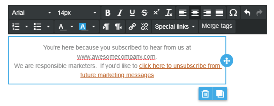
If this is the first email you’ve sent? You need to get them back onto your website. Check out our post about the emails you should send after the first purchase.
You can use the footer to share other information. Promote valuable blog posts. Add links to related products. If a subscriber scrolls that far down the email, they’re engaged and more likely to click.
Don’t forget social media links.
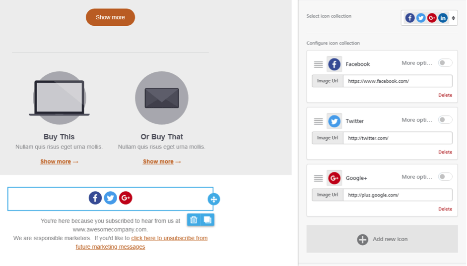
We’ve already given you Facebook, Twitter, and Instagram. We also offer LinkedIn if that’s more your thing. Delete the ones you don’t use. And update the addresses so they lead to your profiles.
Some tips for your email footer
This is important stuff so make sure you send yourself a test to double check all the links are working correctly.
Also, once you’ve saved your first template, you can clone this message so your email footer is always correct (that gives you one less thing to do!)
Adding The Other Content
That’s your header and footer sorted. They won’t change from email to email. Now we need to look at the rest of your template.
It’s made up of content blocks and rows. Let’s look at content blocks.
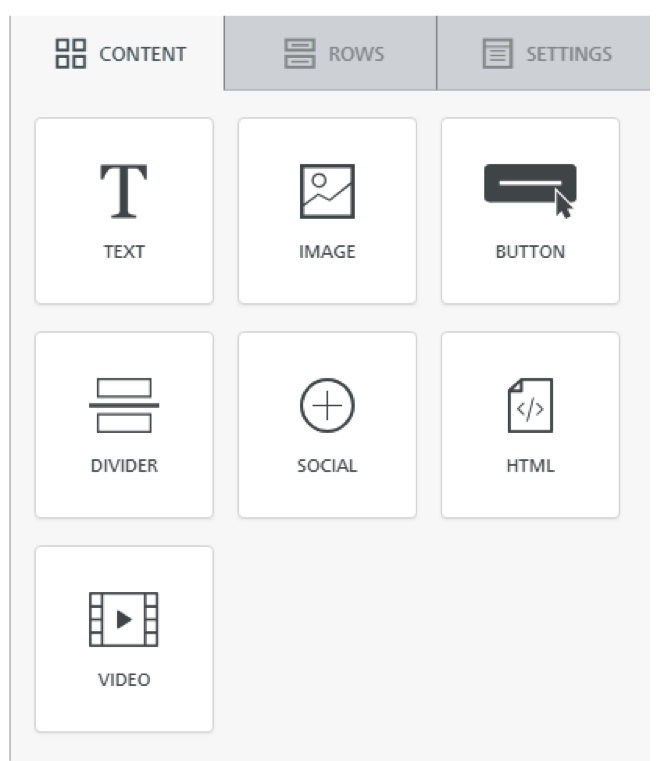
Drag and drop the blocks to wherever you want them. Buttons make it easy for subscribers to click links. Custom HTML lets you add something a little more bespoke to your emails. The video option is good. Shoppers who watch videos are 1.81x more likely to buy than shoppers who don’t view the videos.
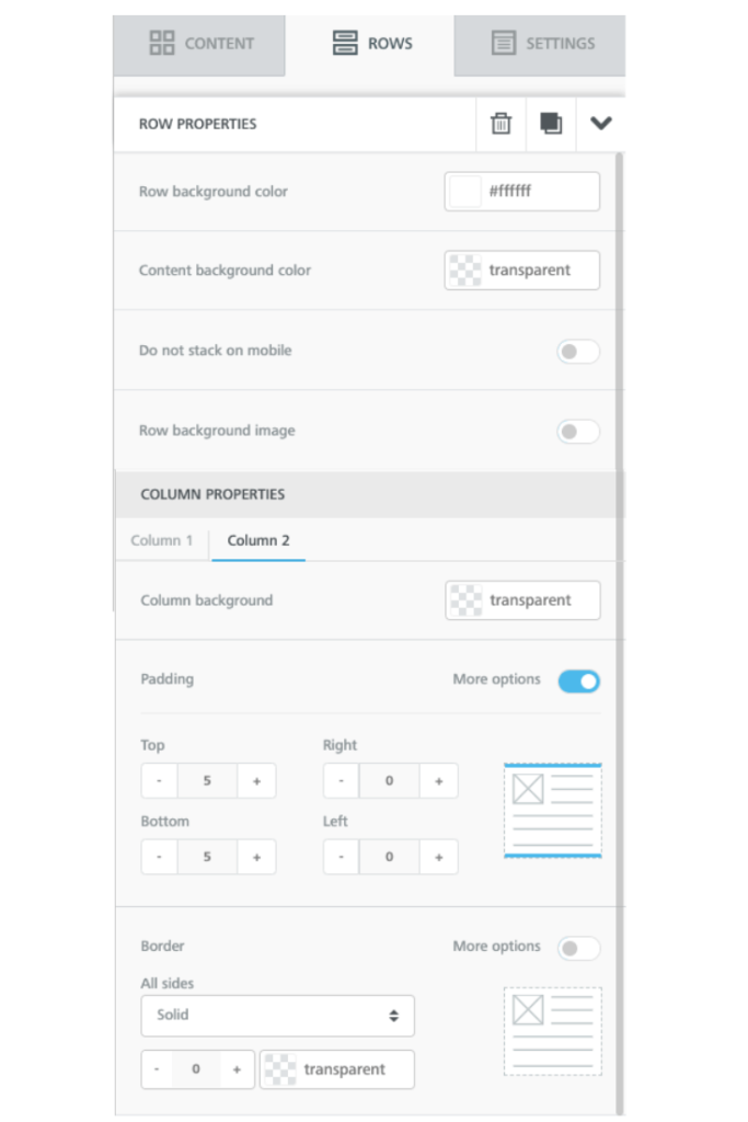
Don’t want to keep something? Delete it! Click on a block in the template. The template panel switches to ‘rows’ on the right. Here, you can edit colours, backgrounds, or hit remove.
Now let’s get on with the text. As nice as graphics are, your subscribers want to know what you can offer them. We’re focusing on welcome templates. This is likely the first email your subscriber gets.
Insert text. Introduce yourself. Explain the value of the lead magnet.
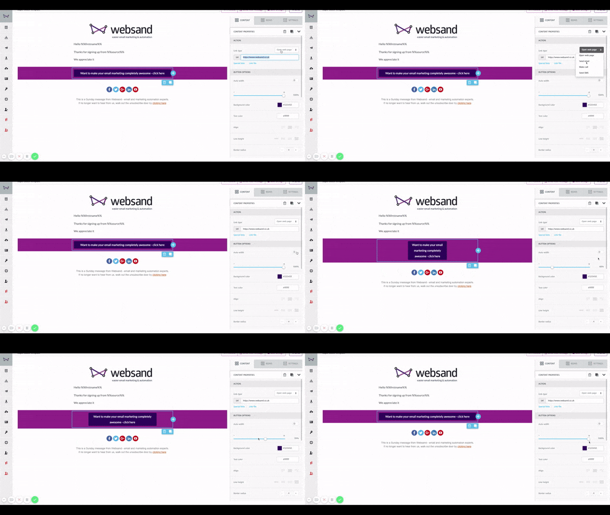
There’s a sample button in the template. Change the colour, the wording, or its target URL. You can direct subscribers to a page on your website, or a page where they can download their freebie.
Button tip!
A quick tip when you are using buttons, “outlook” doesn’t like buttons, so remove switch the autofit option ‘off’ and use the slider and make the button a little bit larger than you like. That will make your button ‘outlook’ friendly.
That’s your template set up! Give your email template a subject line and hit ‘Save Design’.
Using Your Template
There are two ways to use the template. If you’re good to go, hit ‘Send’. It’ll ask you to give the campaign a name, so you can identify it later.
Choose a send identity (good if there is more than just you sending emails).
You can send to your full audience or be more specific and relevant and send to a specific segment (which always gets better results).
We’ve already talked about segmentation before, so we’ll leave that one up to you.
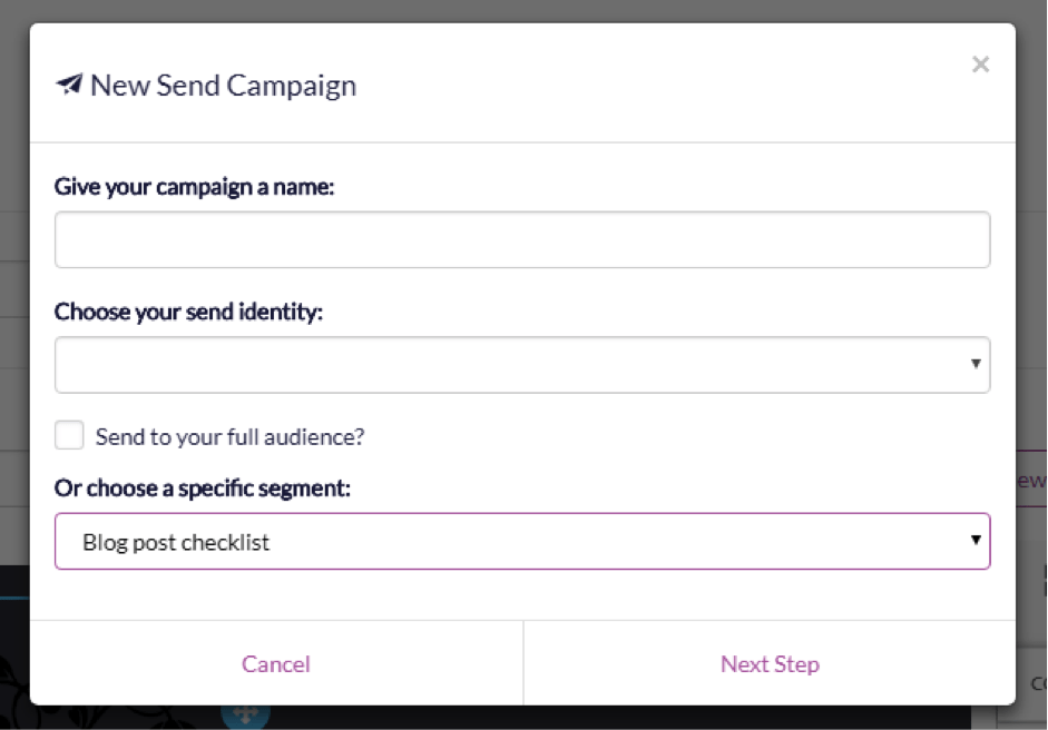
Hit ‘Next Step’. Choose ‘Send Now’ or schedule a time. Away your email goes!
If you’d like to start a new campaign, go to Sends in the lefthand sidebar. Hit +New Send Campaign.
Because this is a general page, it asks you to make an extra choice. You get to select your template. Choose from the ones you’ve already created and hit ‘next step’.
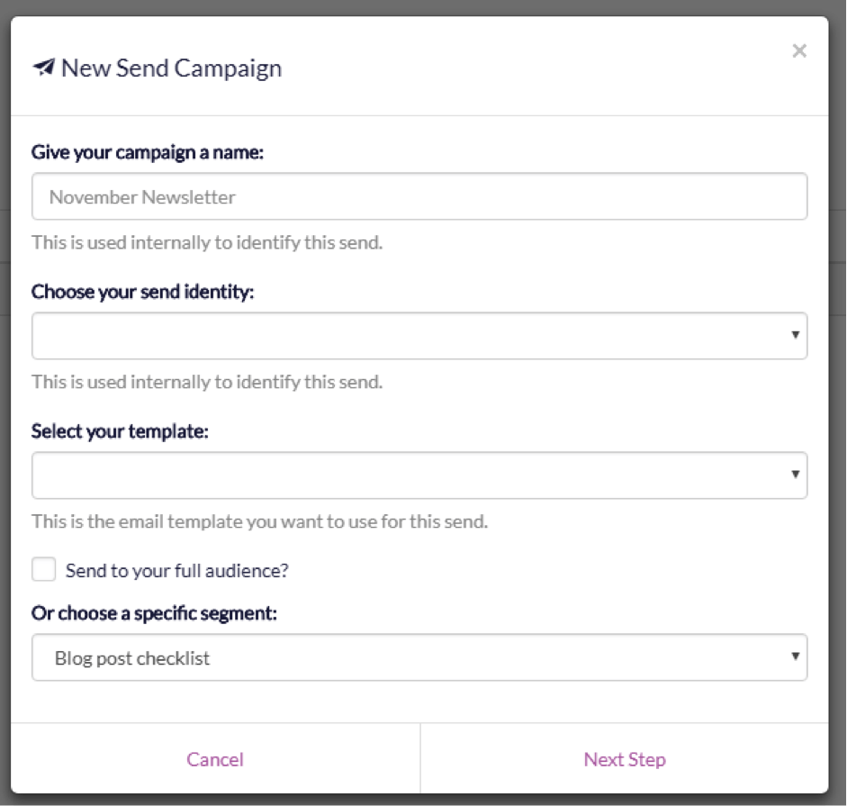
You can also select templates in the Automation area. No more writing new emails every week. Instead, set up ‘triggers’ and Websand will send messages (at the time of day you choose) whenever people join one of your segments.
Do you see how templates can work for you?
We want you to think of these templates as frameworks. Get the design right in one, and clone it as many times as you need to. Just change the content.
It’s all designed to save you time since time is the one commodity we can’t buy more of. Put a value on yours and stop wasting time creating hundreds of emails. A simple set of design frameworks can take the guesswork out of email marketing. It frees you up to focus on your words – the part where you talk to your customers.
And if you want to talk to us about getting started with Websand? We’re standing by.
It’s time to start getting more from your email marketing
Sign up for a free Websand demo and let’s show you how to get the best from your email marketing.
I appreciate the real-life examples and case studies you’ve incorporated into your post. They make the content relatable and applicable.