Do you really need to use fancy email templates when designing emails?
One advantage of social media marketing is the visual nature of the platforms. Share images, videos, or funny GIFs to capture your target audience’s attention.
You may think you can’t extend this same visual aspect into your email marketing. Or you may think using templates is the best way to control the visual nature of your emails.
Either way, it’s worth getting your email marketing right instead of relying on social media. There are 3x as many email accounts as there are Twitter and Facebook accounts combined.
The principles of email marketing can be easy to learn.
- Segmentation? Check.
- Sales funnel? Check.
- Setting up automation so the subscriber gets the right message at the right time? Check.
But excuse me while I squeeze past the giant elephant in the room here for a moment.
One thing keeps getting missed amid click rates, email subject lines, and segments.
Your fancy email template design.
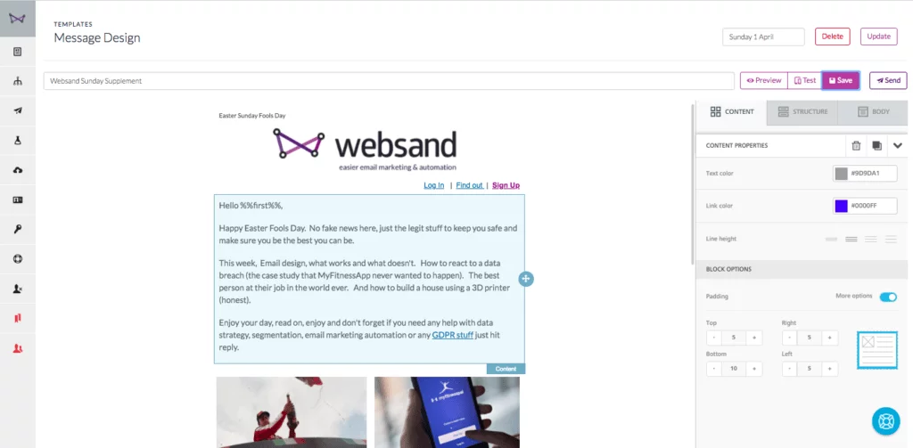
With that in mind, do you need to use fancy email templates when sending emails?
Should you stick to text-only emails that look like Neil in Accounts sent them?
Or is there a third way that gets the best of both worlds?
Only you know what’s best for your business. But we can lay out all three sides of the argument for you.
Should you stick to plain text-only email design.
There’s an argument that emails should stay as personal as possible. You don’t want your emails to look like a digital version of the flyer shoved through your letterbox. Let’s look at the reasons you shouldn’t use fancy email templates.
1. Write and Press ‘Send’ as Fast as You Can
Not using a template has its advantages. Using plain text or a super basic template speeds up the creation process. Plug in your copy and away you go. You won’t spend hours dragging and dropping content until it looks like a page from the Argos catalogue.
2. Avoid the Spam Filter
It doesn’t matter how amazing your emails are if they end up in the spam box.
Emails without a million shiny buttons and graphics are less likely to get caught in a spam filter. If the email looks like it came from a friend or colleague? Email hosts treat them as such.
Having lots of images can also make your emails slow to load. Your subscriber might delete it before it even opens. Or worse–they might unsubscribe.
3. Stay on Message
There’s a reason you’re sending that email. And if there isn’t, you should find one before you hit ‘send’.
But if you add many calls to action, lots of images, and a sidebar full of links? It distracts the subscriber from doing what you want them to do.
Sure, news round-ups and other emails can feature extra content. But if you’ve got one thing you want your recipient to do? Don’t give them a million things to play with.
4. Keep the Bells and Whistles for Your Website
The purpose of your email is to get them back to your website to book or buy something.
Put the videos, images, and attention-grabbing headers on your site, not in your email.
Use the right copy and call-to-action to send them to your website and make that click mean something.
5. You Only Need One Copy of Your Email
Whenever you use images in your emails, you need to create a text-only version as well as an HTML one. Your subscribers lose the fancy graphics if they choose the text-only format.
So why waste time making a graphic version?
They’re five reasons to rethink your use of email templates within your email marketing. But we’re all about balance here at Websand so we also want to give you five reasons you should use templates.
Yes – Email Templates are the Way Forward
Maybe you think you don’t need to use fancy email templates. But so many email marketing companies still offer templates. They must have a purpose, right?
They do. Let’s look at what those purposes are.
1. First Impressions Matter
Accept payments from customers? Then you want them to trust they’ve handed their hard-earned money to a reputable company.
A payment confirmation that looks like a spam email doesn’t scream ‘marketing know-how’.
You also get control over your email’s preview text with a template. The short snippet of text beside the subject line sits in valuable inbox real estate. Don’t waste it by previewing the first line of your email.
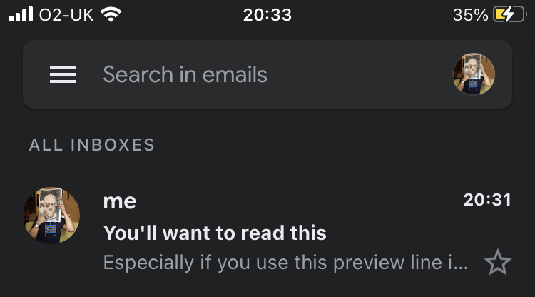
Branding your emails is also a quick way to build a brand image in their mind. If the first email they get after buying something looks like your website? That helps them to get to know you.
Which leads us on to…
2. Consistency is King
You don’t just want your emails to match your website. The emails need to match each other. Get your branding right so your recipients always know whose email they’re looking at.
Using templates guarantees consistency. The only thing that changes from one email to the next is the content. And the journey beyond the first purchase can turn that one-time buyer into a long-time fan.
That’s helpful if you have new members of staff taking on email marketing duties. No one need ever know a different person sits behind the keyboard!
3. Templates Speed Up Your Workflow
The whole point of templates is they’re easy to use and quick to set up. Someone else has done the design work for you. All you need to do is swap out the content as needed.
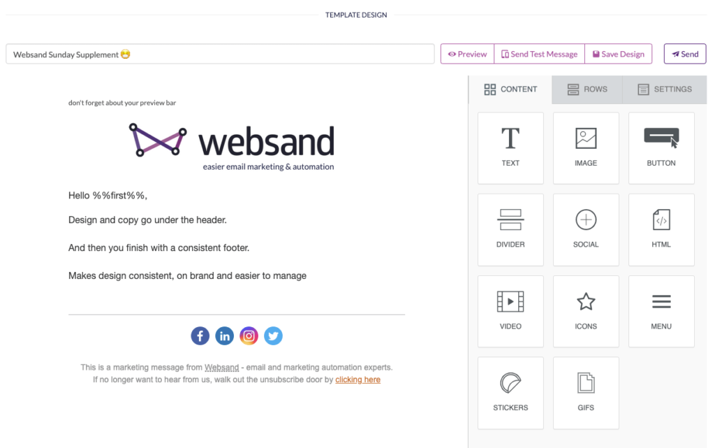
Some providers let you build your own templates. Even then, that’s faster than trying to code things yourself. Use the drag-and-drop designer and create as many templates as you need.
Think of ‘thank-you’ emails, order confirmations, purchase reminders, anniversary emails…
4. Avoid Code at All Costs
Not needing to know code also means you’re less likely to ‘break’ templates.
If you’ve ever looked at HTML or CSS, you’ll know how easy it is to miss a stray full stop and break your code. Ouch.
5. Newsletters Look Better with Images
If you send a news roundup as part of your email strategy, you need more than text. You’ll want to combine headlines, images, and teaser copy for subscribers to read more.
Text-only emails can’t provide the visuals you need. But templates can.
Though you’re right, we did promise a third way. How can you get the best of both?
Use Email Design Frameworks
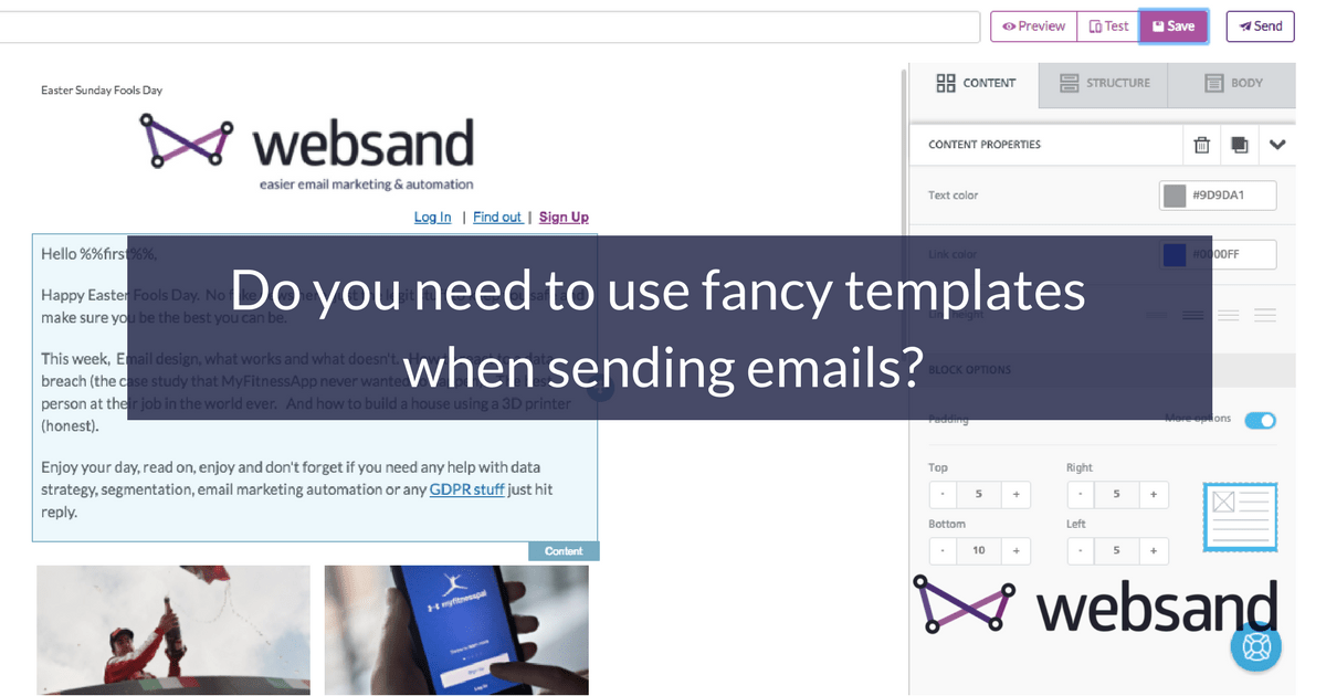
Here at Websand, we don’t offer you ready-made templates (well we do offer a few to get you started). Sure, they’re called templates in the Design window but really, we offer a framework. We give you a header and a footer, and a series of blocks you can add if you want them.
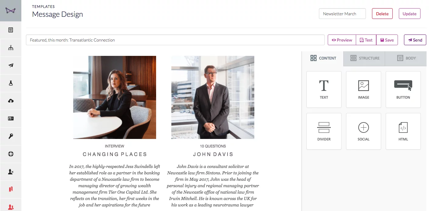
Choose which of the six frameworks you want to use, depending on what it’s for. Get your header and footer right because you’ll use them on all your emails.
Then build your email using our drag and drop framework. Want text boxes? We’ve got you covered. Need dividers and images? Got those too.
Once you’ve created and sent the email, clone it for your next email. Change the content and you’re good to go. It’s like having the consistency of a template, but the simplicity of a text-only email.
Just remember that you’re not emailing a list, you’re emailing people. Think about how the content will help them and provide what they need. And don’t forget to personalise the message by using merge fields – that can make a big difference to response rates.
Only you know if you need templates or a framework
Your business might need templates for stunning visuals, crisp design, and simple functionality. If so, check out these best of breed designs from our friends at really good emails
Or you might need straightforward emails to cut through a cluttered inbox.
Either way, look at your current provider. Are their templates mobile responsive so your emails look great on any device? Are they ready for GDPR? If not, get in touch with us at Websand. We’ll help you get your emails looking exactly how you want them (and we’ll make sure your subscribers give their consent to receive them). Think of us as being Gok Wan for your email marketing.
We’re standing by!
It’s time to start getting more from your email marketing
Sign up for a free Websand demo and let’s show you how to get the best from your email marketing.
Hi to every one, since I am truly eager of reading this website’s post to be updated on a regular basis. It contains good information.