Lesson 1 – A review of Clubhouse Golf’s, 150th Open Campaign
What is Better Email Saul?
Better Email Saul is a series of videos where we randomly review an email that has landed in the inbox of our founder, Saul.
The objective is to review the email based on ‘standard’ email marketing best practices, and provide some tips that will help you send better email marketing in the future.
The emails are reviewed based on the tools available to anyone.
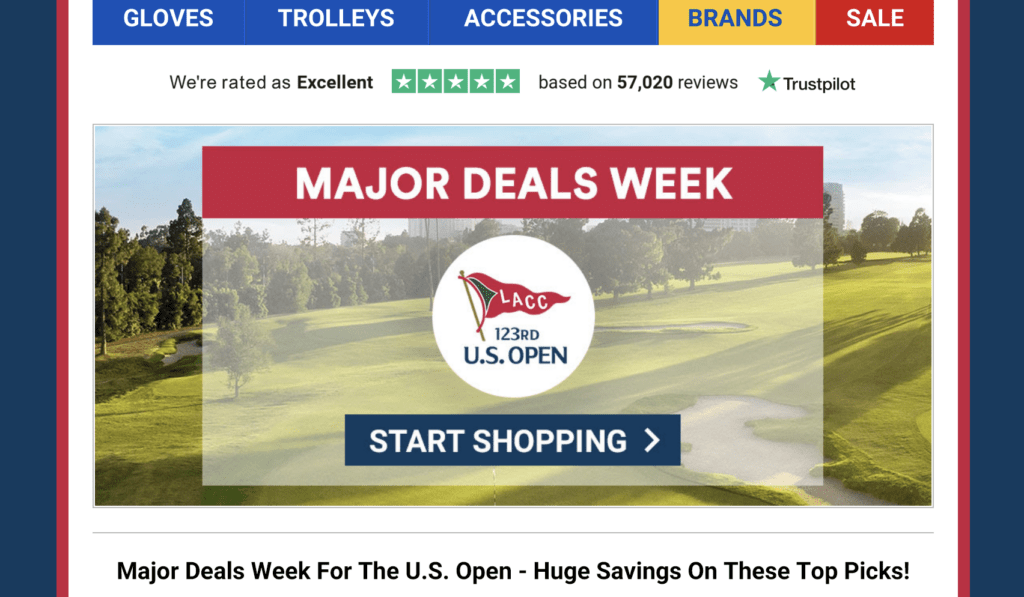
Emails aren’t necessarily from Websand customers, it could be from anyone. In the case of the first entry, Saul is a subscriber and customer of Clubhouse Golf, and their campaign to promote their deals for the 150th Open Championship caught the eye.
Check out the video below and feel free to add your comments.
Better Email Saul’s Email Marketing Best Practice Review.
Hints and tips to help you send better email marketing. Breaking it down into the good and the bad.
Things to improve
Don’t use images as text.
Email marketing best practice is to have a balance of images and text rather than a load of images. The benchmark being 60% text / 40% images.
It looks like the email was designed as a flyer with images used rather than text. If the inbox isn’t set to download images it’s going to look odd and not get the engagement.
Use Alt tags for your images.
If you are going image-heavy, then make sure you use alt-tags as an image description. That helps boost you image/text balance and at least shows the reader what the email template is supposed to show them.
The option to add alt-tags is pretty standard in most email template builders (yes, it’s available in Websand).
Design for Mobile First
When reviewing the email design in dark mode on an iPhone the design didn’t look the best. With some text disappearing, and other sections of the design losing formatting.
For B2C email marketing, we’d recommend a mobile-first approach to design. However, let your analytics will be your guide on which is the best approach for you.
Lack of Personalisation
I didn’t mention this in the video as I got sidetracked by the images as text but come on Clubhouse Golf where’s the personalisation?.
You know who I am, so at least personalise the message a little bit. Like golf, email is a game of incremental gains, and it should add a few more opens to your performance.
The best bits from Clubhouse Golf
The subject line
As a subscriber to Clubhouse Golf so I know what to expect, but a great subject line is needed to grab my attention.
Best practice suggests a subject line of between 6 and 10 words. Chuck in an emoji or two and you’ve got a winner.

Shame about the lack of personalisation. Would have turned a birdie into an eagle.
Theme is aligned with the business offering
As you’ll see above Clubhouse Golf promises ‘bigger choice with better value’, and the offers contained within the ‘Major Deals on Sunday at The Open’ email offered just that.
The message was perfectly aligned with everything they stand for. Something that shouldn’t really be highlighted, but does your email marketing content align with what your business is all about?
A compelling reason for the subscriber
If you’ve signed up to Clubhouse Golf’s email marketing, you want to know about the deals they offer. Add in a time-sensitive deal aligned to one of the most important weekends of the golfing calendar and you should be looking at the golfing equivalent of Black Friday.

Great deals x this weekend only = where’s my wallet
Email Marketing Technical Check – White label setup in place
Clubhouse golf has over 45,000 reviews on Trust Pilot so I’m thinking they have a decent-sized audience. Based on a search of ‘Clubhouse Golf’ in my inbox I get a decent number of deals in my inbox, at least one per week.
With that volume and a large volume size it’s crucial to have their setup correct. A quick check using ‘show original button’ in gmail shows me that they have their technical setup in place, which is a great help to deliverability.
The Better Email Saul Summary
Whilst not exactly aligned to email marketing best practice, in terms of email design, the content is perfectly aligned to the business offering and exactly what subscribers to Clubhouse Golf would expect.
I’m sure they are happy with the results they are getting from their email marketing, but there is scope for improvement.
I’d be recommending adding some personalisation, testing a mobile-first approach to content design, and looking a some segmented targeting – as opposed to a blanket approach.
Note – the last point is based on an assumption that the message I have received has been sent to everyone else that has subscribed to Clubhouse Golf.
Need help with your email marketing? Better Email Saul
If you have an email you need help with, or just want an opinion on and want us to review, send it to besaul@websand.co.uk or book some time with us on the calendar below.
